Entries
8/09/2020 - Initial Version Control Scouting
2/10/2021 - Rethinking my Design
Overview
I've been building an android app for a project idea I had. As I mentioned in the about section; I won't always make entries for my projects. I don't plan on distributing this app on the app store, but I plan to use the app myself. I want to use a different logo than the default app logo, and so this is a good opportunity to try logo design.
I've never designed a logo before, but I would like to design a personal one in the future. The lack of distribution makes this a good, low pressure project to try out first.
Even this wouldn't necessarily be a good reason for a blog post, but I've always been interested in the idea of using git for version control with design. Since inkscape uses svg(a text file) as its default file format; this feels like a good place to try it out.
Since the main goal of this project is to make a usable logo, I'm listing it as a studio project. I'll first go into detail about the app then git.
Objectives
- Design logo for Cyclegrams app
- Practice logo design
- See how useful git is as design version control with inkscape
Cyclegrams
The app idea is based on a form of journaling I've been doing for the past few years. You have 366 notecards(one for each day of the year plus leap day) and on each corresponding day you add a one line entry for the current year. I like this because it allows me to reflect and gives me easy access to past entries. Unlike an actual journal; you don't get caught in some massive nostalgia binge every time you look back through your entries. It's roughly a five minute reflection process; since each entry is one line. Social media can do this to an extent; but it isn't as comprehensive(only when you post or upload pictures). I find it much easier to write one sentence about my day than upload a photo per day. And I don't always want this info to be public so social media is out of the question anyways.
My main problem with this is how I'm implementing it. Having to carry around a giant stack of notecards isn't ideal. And each of these cards are valuable; even losing one would be frustrating. But this lends itself naturally to a phone app. I can store the data locally, but back up the database. And having your phone with you most of the time is almost a requirement nowadays.
I've never built an android app before so this is a new experience for me. But unlike, say, OpenSCAD, there are already a lot of tutorials for building apps online. And I'm not exactly doing anything novel here; it's a pretty simple app. So I didn't see any point to making a blog post on the app itself. I'll work on the app concurrently with the logo design process. I find context switching between technical and creative topics is mentally refreshing for me; though this will probably result in large time gaps between entries.
Git
Version control seems like it would be useful for the creative design process. In the past I've always made different save copies but this is ugly and gets annoying. Using version control, branching, and tags all seem like great ways to keep track of history and different iterations.
I've tried discussing this with others and have gotten mixed results. Some claim it would be useful, but its difficult to use. This is fair; I'm not sure how strong current VC offerings are from Adobe and other creative companies. And I don't think most creatives are comfortable with git or svn. Implementing vc for binary files is still considered non-trivial. Some companies support it, but it's not as easy or natural as with text files. And most VC is still focused on software projects.
Other claim vc is unecessary. Good use of non-destructive editing and layers means you can rebuild your design to any previous iteration without saves. I've heard that Adobe also has a perpetual undo feature which is helpful for retrieving old versions. I definitely agree that learning to design correctly with layers is important and version control shouldn't be a crutch to avoid this.
But at the same time; I don't feel that the latter group has given version control a fair shot, mostly because they can't. It doesn't feel like there are any strong VC methods for creative projects. Most seem far more trouble than they are worth. But with inkscape there might be some potential. Inkscape uses a text file(svg) as it's main file format. I can simply use a typical programming version control system; git being my preference.
I should point out that my goal here is to evaluate how useful git is as a version control for design for ME. I'm not a creative and have a nearly orthogonal skillset to them. I have no way of evaluating whether it will be helpful for creatives in general. But it is easy to determine how useful git will be to me and others can read and evaluate this process for their own skillsets, should they care.
But, at the very least, I should look into how people online have used version control for design. I've not found information on this previously, but I also havent explicitly looked for it either.
8/09/2020 - Initial Version Control Scouting
First, I spoke to a friend of mine in graphic design. She actually made a good point. She typically has an idea in mind when approaching a design; so branching and tagging isn't necessary. This makes sense and is something to keep in mind when I'm using vc for myself.
I found a few articles discussing VC for designers but they all seem old. There used to be a tool called PixelNow, which was a gui wrapper for SVN. Adobe also had a VC system called Cue. I can't actually find PixelNow anymore, but Cue seems to have been integrated into Adobe's Creative Cloud. CC saves a history of file version and you can mark different version with names and save them from deletion. This sounds like it does the bulk of what VC offers and since it's built into CC; it's easy to use.
This site has a list of version control solutions for creatives. Some of these are baked into applications but some are standalone products. These look similar to Adobe's in built solution. The main thing they add is collaboration. I don't have the bandwith to test these out myself, but it's worth noting that there do seem to be lots of VC solutions for creatives. So my initial conjecture appears to be incorrect, something also worth noting.
This last article, actually has a designer using Mercurial. They even explicitly mention that Svgs when using inkscape is an excellent use case. While old(2016), it implies that designers actually tend to ignore VC and the article suggests using VC for creative projects. That implies that even though VC exists for designers, it's not really used(these are just a few samples; so take this all with a grain of salt). This could be because it's not actually useful. Or people don't want to try new things. Or something else I'm not thinking of. But most of this is academic; I'm not a creative, so our skillsets/objectives may not support the same workflows anyways, and I don't need to focus too much on this
But my friend's point; that having a strong design goal in mind may limit the usefulness of VC, is definitely something to remember.
12/29/2020 - Initial Sketch
I began with a quick initial sketch. I don't have a drawing tablet so I did this with my mouse.

This obviously isn't very good. But the idea I'm going for is a letter surrounded by a "cycle" circle. This feels like a nice simple logo that's vaguely related to what my app does. It also should go nicely with the circular icons I use on my phone.
1/24/2021 - First Attempt
I started by trying to create the circle with an arrow. I first tried creating a circle and was going to align an arrow on it but I realized this wouldn't work with just black and white colors. I was taught to initially design a logo in black and white(helps with color design and seperation) and so running into this issue so quickly wasn't promising. I then tried to use a "C" letter from a sans serif font as a base. This would give me a little seperation between the arrow and the loopback.
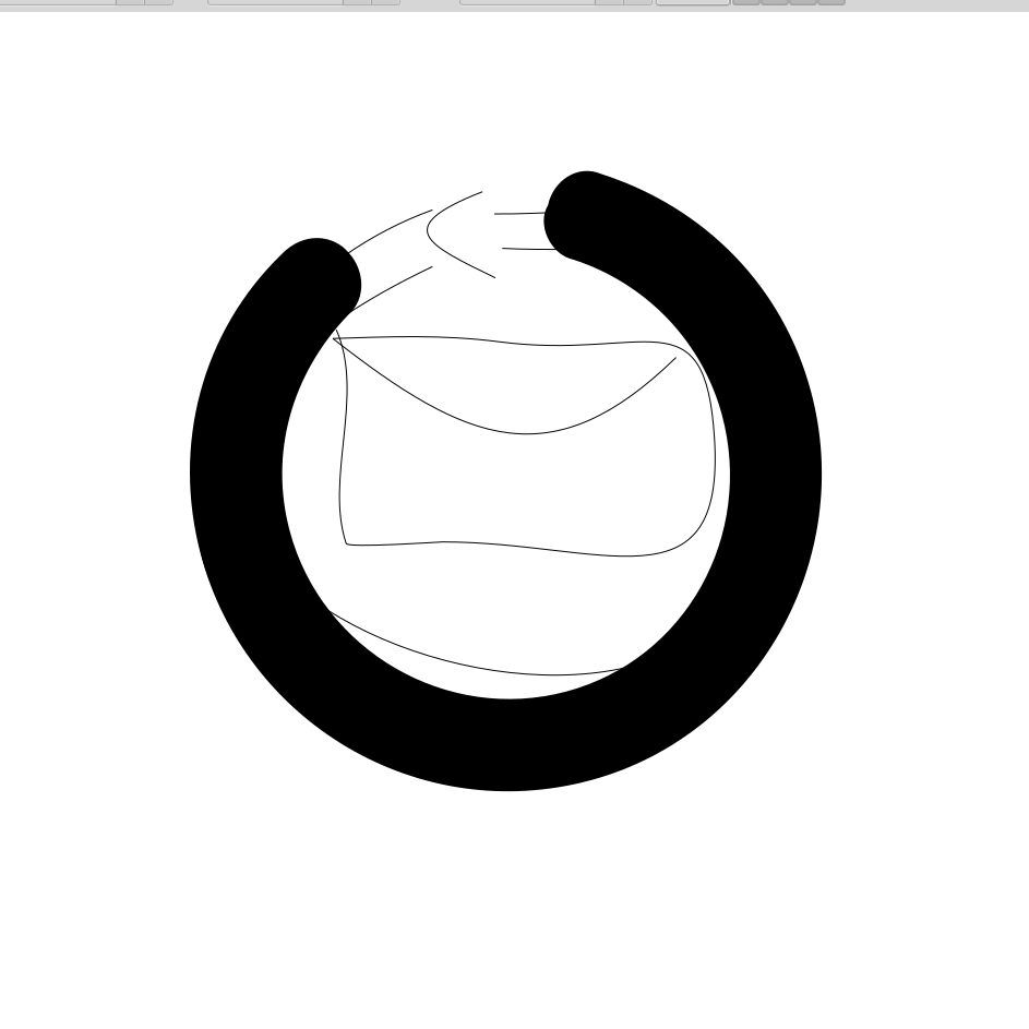
But as I review the app logos on my phone, I feel that continuing with my design would result in one that is way too busy. Even if I thin out the C; it feels like there will be too much going on inside with the mail graphic. I think I'd like to rethink my approach.
2/10/2021 - Rethinking my Design
My sketch idea wasn't bad but since app logos are so small I think it'll be a little too busy with the lines for the letter.
So let's take a step back. Instead of thinking so literally, what's the first thing I think of when I hear cyclegrams? For cycle I think of a bicycle. Gram may reference a message in this case but when I hear gram I think of those tiny gram weights we used in high school science classes. Maybe I can try combining these two instant thoughts?
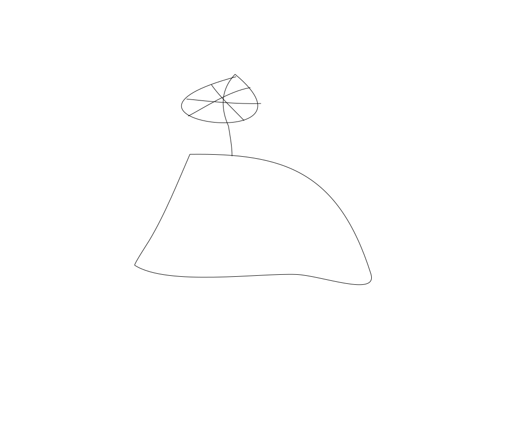
Again this isn't very good, but it's basically a trapezoid with a spoked wheel where the weight hook should be. This is a relatively simple design(I may have to play with the number of lines in the wheel), but I can't find anything similar. The closest would be logos that use the same weight concept but they don't have spoked wheels as hooks.
Since I'm taking a new direction with my ideas, this looks a great oppurtunity to use branching. And git makes this easy with a simple git branch command. I kept the original sketch in a hidden, renamed layer but if I decide this direction is a dead end; I can just revert to master instead of reconstructing my original project with layers.
2/13/2021 - First SVG
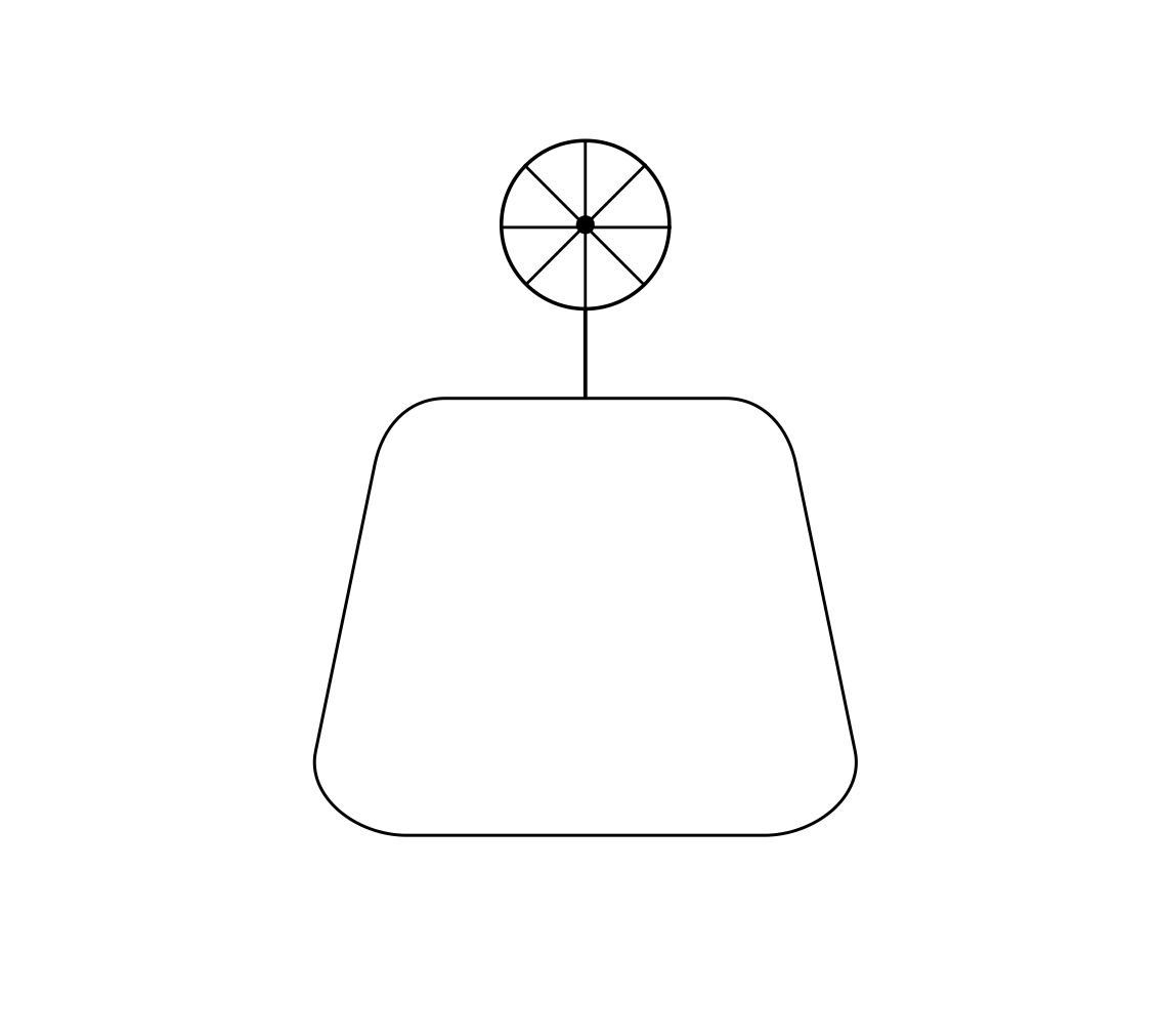
This isn't too bad. I'm not going to win any logo design awards, but it's simple. I'm also not going to mix it up with another app, and it should still work even when it's shrunk down to an app logo size.
My next step will be to colorize it. I have some idea of how I want to approach this. I'll probably use a light teal for the weight fill and a soft beige for the wheel spokes. The weight fill should be easy but the wheel spokes aren't an object I can fill; so I'll have to be a little more clever with that.
3/2/2021 - First Draft
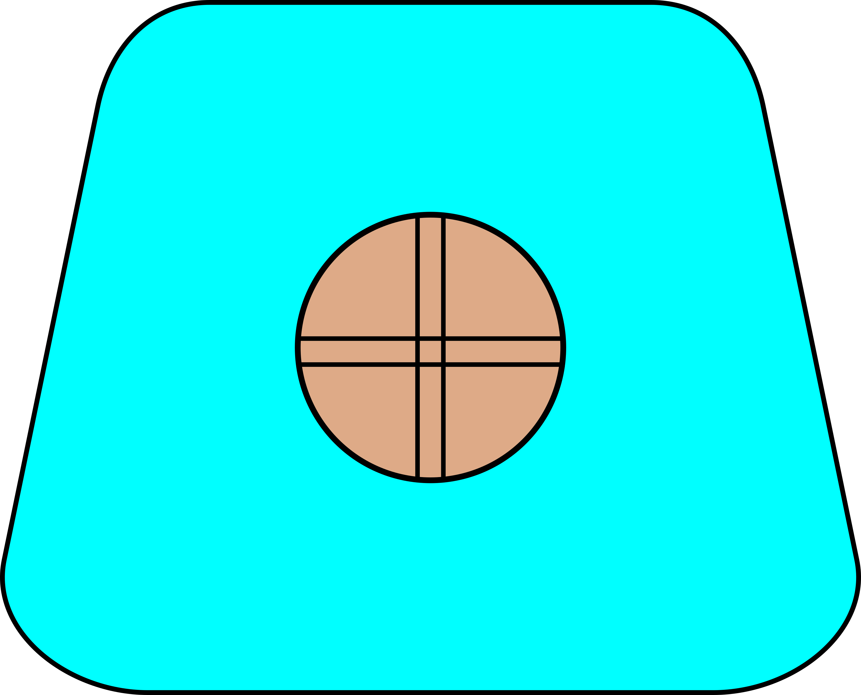
So this is the first draft. I ended up changing the wheel spokes to a cross pattern because I like the visibility of the cross when scaling the logo. The coloration was what I expected but I ended up not liking how the wheel just kind of jutted out from the top. It also didn't feel like it scaled well when resizing. So I ended up moving the wheel to the center of the weight. This does feel extremely simple but I think this is still unique enough(especially for a personal app logo that will not be distributed).
The final change I made was to remove the dot in the center. I'm not exactly sure why I prefer it. It might be because the black and white structure of the logo is primarily negative space so having a small filled part in the center feels inconsistent? I'm not really sure; I'm just stringing together artistic sounding words in a way that sounds correct. But I do prefer this logo and will consider it for my first draft.
At this point, I'd like to let my mind "sit" for a few days and review this later. If I'm still okay with it then I will consider the logo design finished.
3/5/2021 - Review
Well I've thought about it for a few days and I think I'm going to go forward with this.
Obviously, it's not "perfect". It feels too simple and I'm worried it may not be unique enough. But since I want a simple logo, it seems aggressive to criticize it for being "too simple". The lack of uniqueness isn't critical since I'm not distributing this in any way. I usually find that I never consider my art projects to be "perfect" and I'm told this is fairly common.
Apparently the wheel plus design I used is a very common design called a sun cross. Despite this, a sun cross in a trapezoidal shape like mine doesn't appear to be an existing logo so I should be okay.
The next step would be to merge my branch back into main since I'm going to select this as my main logo. Since I never made any changes to master this ended up being utterly trivial and not a real test of git in this context. I did try making some small changes but wasn't able to create any major merge conflict. And I didn't think artificially trying too hard to create a merge conflict was a good way to practically test git.
At this point I will mark this project as stalled. I don't want to declare it finished until I see the logo in my app; I will probably make some minor adjustments at that point. But I've been making poor progress in my app development and am unsure when I'll get around to finishing it.
However, I can make an assessment of git at this point and will do so before moving to finish the app.
3/6/2021 - Git Assessment
After a bit of consideration I think Git is a good fit for me in these kinds of projects.
I didn't get the chance to truly test git with some sort of esoteric merge conflicts but what I did get to see is promising. The xml structure of svg seems to be very intelligently designed. It's actually based on the concept of layers and each layer is a top level xml tag. So all of my changes looked coherent in the xml.
Even if this isn't a strong case for git, it's worth nothing the effort of using git here was non-existent. I'm so fluent in git from work/personal projects, simply making commits with comments is trivial. The "design log" this ends up creating is probably more than worth the marginal effort of using git. Even if branching and merging turns out to be more trouble than it's worth, the git history and logs are sufficient.
So my evaluation is that I will continue to use git when working on inkscape projects. If I end up changing my mind about this later, I will amend this entry.