TLDR
I wanted to redo my resume so I designed a layout in Inkscape and investigated several tools to implement my design. Scribus was the one I selected and I feel it's an excellent choice for resume design. But Scribus itself has a large learning curve and you really need to be using styles correctly to get the most out of it. This may discourage a lot of other users.
Entries
4/9/2020 - Zack Grossbart's Blog
4/15/2020 - Bruce Byfield's Work
4/16/2020 - Designing with LibreOffice
4/28/2020 - Finishing Sample Content and Layout
5/03/2020 - Picking Initial Fonts
5/24/2020 - Finishing up Styling
Overview
I created my resume right after college using a LaTex template I found online. I became familiar with LaTex because of college assignments and liked that I could edit the tex file in vim. The layout was pre-designed so I didn't need to worry about it and could focus on the content of my resume. I've been updating it since, but I'm finding the layout doesn't communicate my skillset well anymore.
Making the drastic changes within the LaTex is getting too cumbersome so I've decided to take a step back and redo my resume. I want to investigate other ways of creating my resume to see if LaTex is still the best fit for me. I'll start with creating a sketch of what I want my resume to look like and then iterate through different options.
I work as a Research and Development engineer(mainly with Computer Vision and Software). I have a specific layout in mind that I'd like to use but I don't need an extremely flashy resume like a creative might. Similarly, the main distribution for my resume will be print instead of web, so I want to focus on tools that are for the print medium. However, it will likely be viewed on pdf viewers so I should still consider how it presents on a screen. I would like to include some color, but technical resumes are often printed in black and white so I want to make sure my resume still looks good in black and white.
Objective
- Investigate different formats for a resume and determine which is best for my purposes
3/31/2020 - Resume Sketch
I've found that my artistic process works best when starting with some sort of sketch. I used to do this with pencil and paper; but after getting more familiar with inkscape, I've begun to prefer it. Being able to move things around makes visualization and planning much easier; instead of constantly redrawing and erasing. I don't have a drawing tablet(and find it hard to justify for planning sketches) but the mouse is adequate for this. I use LibreOffice Draw for technical and engineering diagrams but when playing with layout I prefer Inkscape.
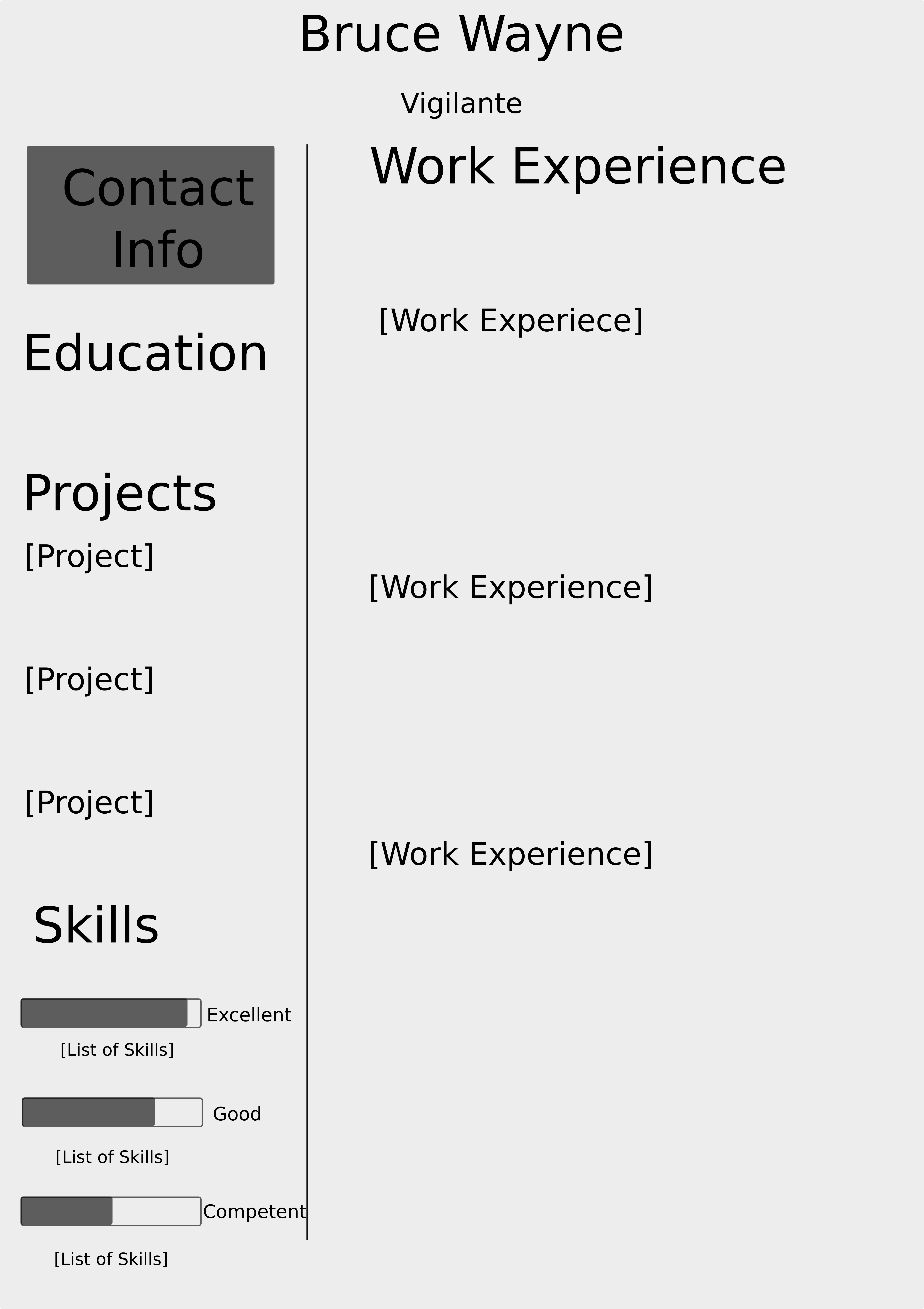
My old resume used a two column format and I started with a mock of that. I like the two column layout because I feel it seperates information and makes it easier to read in one glance. In my (albiet limited) experience reading resumes; employers in these fields usually use resumes as a quick heuristic to determine whether a candidate is worth speaking to. That initial phone screen then determines whether an interview occurs. Walls of text can be intimidating, especially if they're going through dozens of resumes. My guideline is if it takes longer than fives seconds to parse; it will probably be ignored. Two columns forces me to keep my text more concise and creates a simple progression for the reader to follow.
One change I wanted to make is emphasizing work experience. The old format kept both columns the same width. This made sense right after college; as my personal projects felt very important. But now, my work experience is where I want emphasis, so that column will be larger.
Something else I added was meters for my skills. The old version only had the rating(Excellent, Good, Competent), but I like the visual touch a meter adds.
4/1/2020 - Google Docs
I don't think Google Docs(or any word processor) will work for me, but it's something that I should try. They probably don't have a template that matches my design and I've found that word processors are difficult to use for resumes unless their templates match exactly what you want.
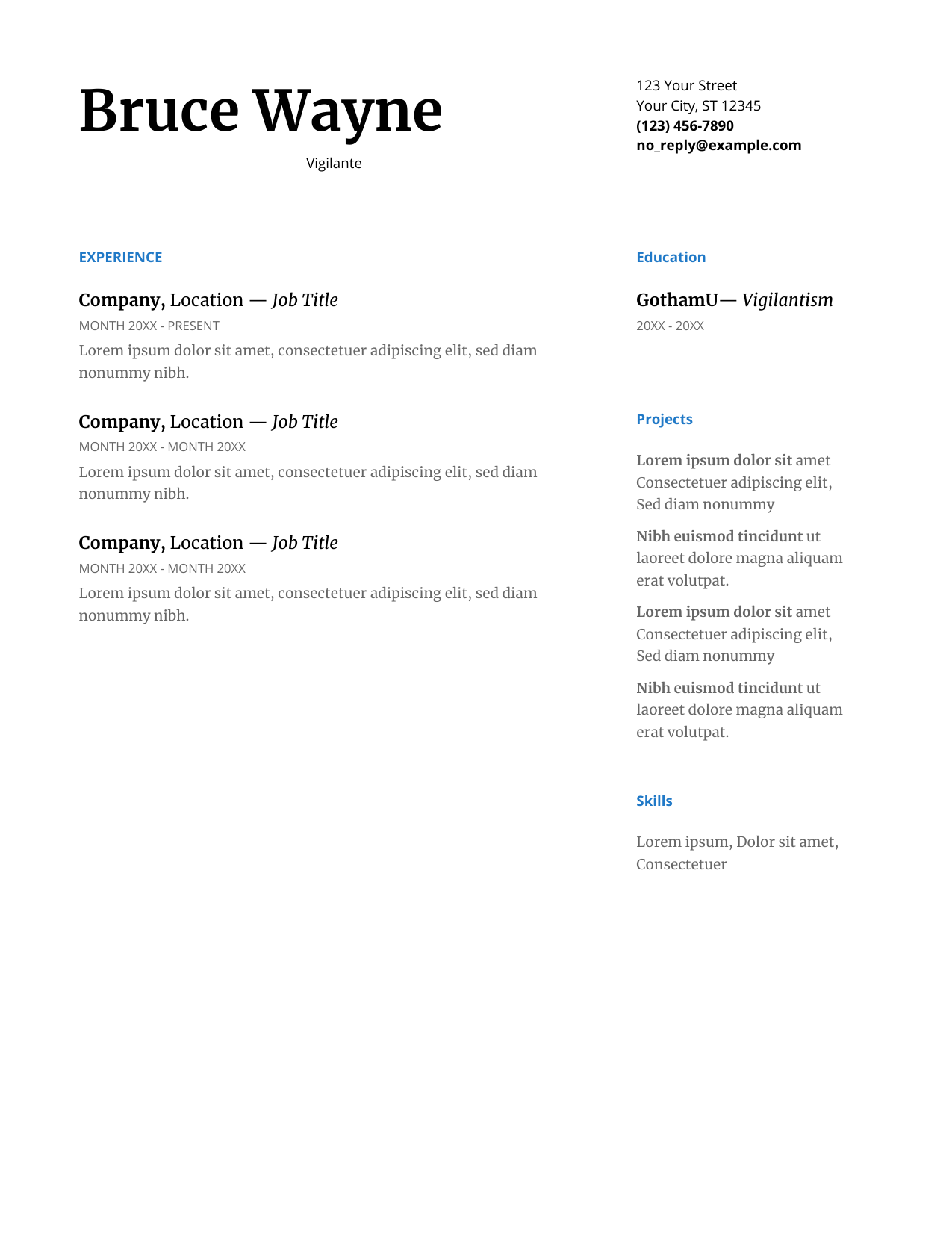
This proved to be accurate. The Google Docs Serif template was closer to what I wanted than I expected; but as I tried to make adjustments I found myself struggling with the limitations of Google Docs. But the template is visually appealing. It is unlikely that a resume designed by me will look quite as good, but that's a trade off I'll have to make to get my desired layout.
What I liked:
- Template looks great(at least better than what I could do)
- Templates provided me with a lot of options and ideas
- Very fast and easy to get a working resume
What I Disliked
- Getting the specific layout I wanted seemed like an unecessary amount of work
- From experience, I know that editing the resume over time is going to be difficult
Google Docs would've been perfect if I was okay with selecting a template from their selection and using that. I would've gotten a professional looking resume with minimal effort. Because of my layout needs I should look at other options. The next method I will try is Scribus.
Word Processor Update - 4/15
After reading Byfield's blog post on LibreOffice's effectiveness in desktop publishing I wanted to look at Google Docs to see if they have similar features I didn't know about it. You can't insert text boxes, but you can insert drawings and put text in them. This feels like a hack instead of a genuine solution. After some googling and experimenting I couldn't find any good layout or alignment tools. There are add-ons that seem to add these features, but I don't think forcing Google Docs to do what I need is the best option.
4/8/2020 - Scribus Tutorials
I've never used Scribus before so my first step will be to investigate how I might use it to build a resume.
It was during this research that I discovered that LibreOffice might actually be a good fit. I don't want to start a tanget here, but after trying out Scribus I will look at LibreOffice.
I found some video tutorials for scribus here. I prefer video tutorials for GUI applications because I find them to be clearer than documentation or blogs. In addition to showing you the tool, they also show you different use cases which is always helpful. And even when they're out of date; they often give you enough info so that you can usually figure out the updated variant from Google or the docs. However, these tutorials are from mid 2018, which is only two years ago, as of this writing. I didn't watch every video; only the ones I needed, but the videos were excellent. It looks like in Scribus my approach should be to create a bunch of text frames and arrange them in the way I want.
4/9/2020 - Zack Grossbart's Blog
The next area I want to investigate is to find if anybody also tried building their resume in Scribus and how that went for them. Surprisingly I found a blog post that does exactly that here.
At first I thought this post was just building a resume in Scribus, but it's actually very similar to what I'm trying to do. The author, Zack Grossbart, went through a similar desire to redo his resume after realizing some weaknesses and went through a similar process. He discusses design decisions, assembles a layout, and then tries out different applications. He tries OpenOffice(LibreOffice's predecssor) and then Scribus. He makes a resume in Scribus, but then tries InDesign and likes it a lot more. This surprised me; I know for design professionals that InDesign is considered superior to the open source alernatives, but I expected it to be sufficient for the rest of us. Grossbart has a similar engineering background(and open source preference) like me, but he still felt InDesign was worth the cost.
This is a very strong recomendation, but I think I will use Scribus for this experiment. I dual boot Windows, but only use it for gaming and use my Linux partition for everything else. If Scribus is the best tool, I will use the Creative Cloud trial and then decide if InDesign is worth it for me.
Another aspect of design Grossbart emphasizes is typography; which Wikipedia defines as "the art and technique of arranging type to make written language legible, readable, and appealing", at the time of this writing. This is a not an area I had considered before, but it makes sense to do so.
One detail I note is the post is somewhat old (2007, so 13 years old at the time of this writing). In 2007 Scribus was only 4 years old and LibreOffice was still OpenOffice. It is likely Scribus has made improvements since then and I know LibreOffice has. It also seems that I'm not quite as experienced as a designer as Grossbart. Those two details may make Scribus and/or LibreOffice better fits for me; when compared to InDesign.
Grossbart's blog also helped me realize two tangential details. First, the font of my own blog could be improved. Second, his blog is also somewhat of a project blog, just like what I intend for mine. So at some point I should revaluate the typography/font of my own blog. And I should revisit his blog as I develop mine.
4/10/2020 - InDesign Blogs
I wanted to find more examples of blogs that describe a design process for resumes. Especially after Grossbart's reccomendation, I was interested to see this approach with InDesign. But I couldn't really find any... Most blogs for InDesign were step by step tutorials showing how to build a resume in InDesign instead of a design analysis. There were a few articles that listed off some good design principles when building a resume, but nothing like Grossbart's blog. It's possible that I may just have to look harder but I don't want to spend an inordinate amount of time on this kind of preliminary research. If I find something later; I'll use it, but for now I'm going to move on.
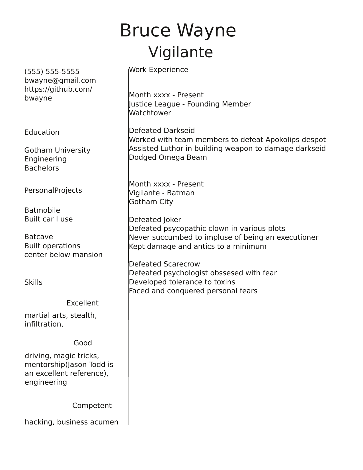
4/14/2020 - Scribus
I started by importing my svg sketch into Scribus and pushed it into the background layer with some transparency. I find doing this with sketches makes them helpful references.
Initially, I was struggling with Scribus. I tried creating text frames but I found myself struggling to format my text correctly. None of the options I was familiar with from word processors were there. I guessed I was using Scribus incorrectly and downloaded a template to see what they were doing. It seems that most text formatting in Scribus is handled through something called a "style". You're supposed to pre-design your styles and apply them to the relevant areas of text. This is apparently a common theme in Desktop Publishing. I noted how similar this was to CSS before realizing CSS stands for "Cascading Style Sheets" and this is likely where this concept came from. I hadn't watched the Styles tutorial in the video tutorials because I didn't know what styles were or that I needed them, but now was the time to fix that.
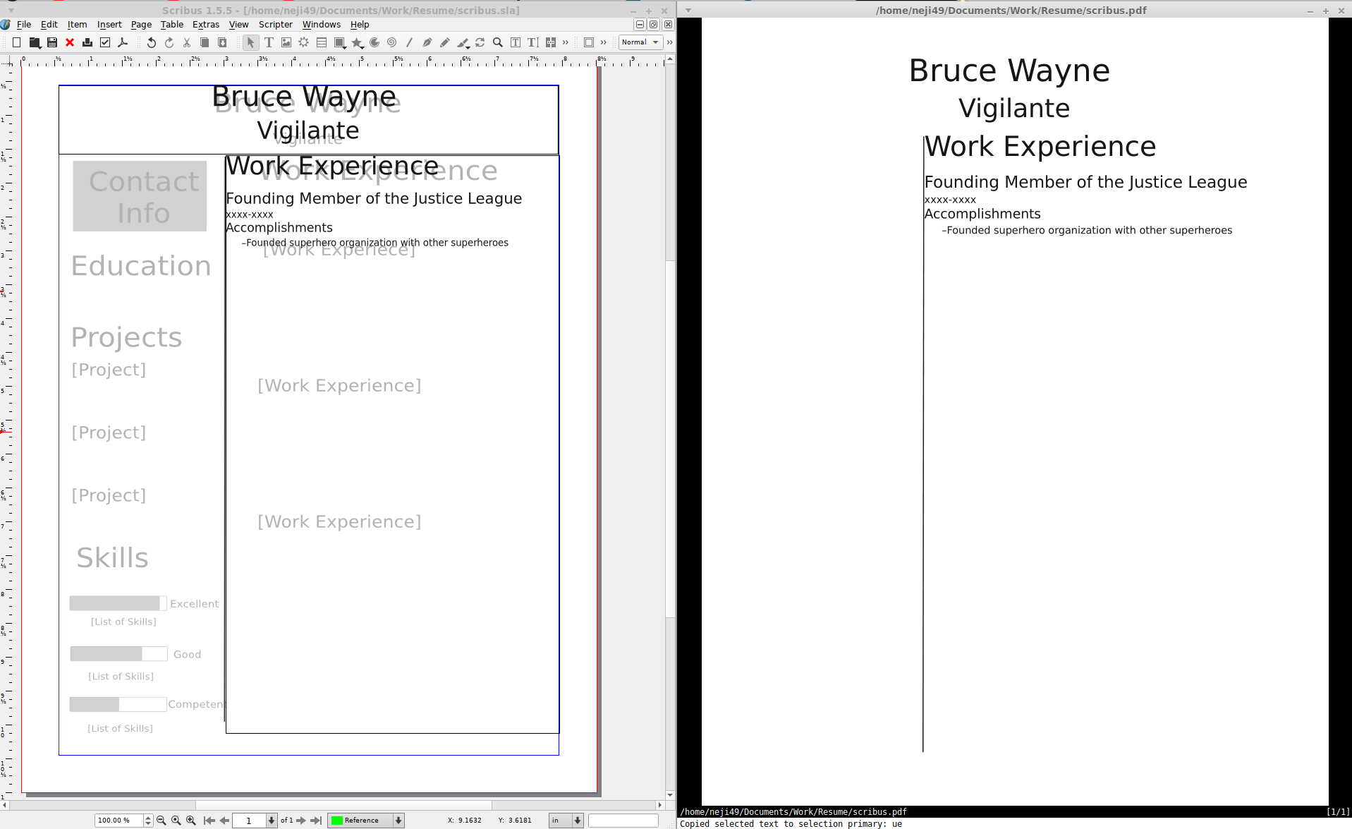
After learning how to use styles I very quickly came up with a simple, unpolished draft. This isn't a working version but it's a start that let me try out how Scribus might work. I expect to finish I would need to finish planning out the styles and fill out the resume. However, at this point I want to make a similar attempt in different applications. Once I decide which one is best, I will complete that version.
What I liked:
- SVG support and layering are great
- Movable text boxes and alignment tools making it easy to generate desired layout
- Styles mean I don't have to redo work when making changes
What I Disliked
- Not sure ....
It's hard to say there was anything I disliked about Scribus. There was a learning curve, but that's always the case with new software. But I'd like to try LibreOffice before making a decision, maybe I'll learn something there.
4/15/2020 - Bruce Byfield's Work
Initially, I didn't want to try word processors for building a resume. I tried out Google Docs and it didn't really work out. However, I found this article, that implies LibreOffice Writer is desktop publishing software. The, author, Bruce Byfield, also wrote a book titled Designing With LibreOffice. He's interviewed about this book here. This is his site for his book and has a link to buy or download it. I decided this would be something to investigate. I regularly use LibreOffice as my main word processor and if I can adapt it for my resume, it would be convenient. Byfield also seems to have familiarity with Scribus, so his opinion here is quite developed.
This also motivated me to reinvestigate Google Docs. I've put my update as an addendum to my Google Docs entry here.
I first started by reading Byfield's interview. I noted that his background is in graphic design and technical writing; so he is a professional in layout and publishing. He, like Grossbart, also mentioned the importance of typography when it comes to design. He discusses the importance of styles in LibreOffice and says they're critical to using LibreOffice well. He compares styles to variables in coding, which is personally, a helpful analogy. All of this would've been nice to know when using styles in Scribus.
Byfield even claims that LibreOffice Writer is better than Word as a Word Processor; and considers it to be a mid-level Desktop Publishing Software. He references that the control isn't as fine as Scribus, but more than powerful enough for a lot of use cases. He continues to assert that most people haven't realized that FOSS software isn't playing catch up in this area. Considering his professional experience, this is a powerful statement. It strongly implies that LibreOffice Writer is probably my application of choice. I'm looking forward to reading his book and investigating this claim myself.
4/16/2020 - Designing With LibreOffice
I was impressed with Designing with LibreOffice; it's really more of a book on design than documentation on LibreOffice. There's even a section on slide design I should look at later. I didn't read the book completely; I read some parts and skimmed others. I learned about styles and their use cases. It was here that I realized that I handled Scribus incorrectly. I should have done manual formatting with text properties and then developed the styles later. Developing them beforehand just wastes a lot of time changing unecessary options. Byfield is a big fan of using styles and templates but recognizes when they are unecessary. Even with the limited scope of my resume, I still think it's appropriate to use styles here. Styles may take time to step up, but they will make editing and maintaining my resume over time easier.
So I should start with using manual formatting to create a LibreOffice sample like my Scibus sample. Then I can decide which application to settle on and go through Byfield's full design process.
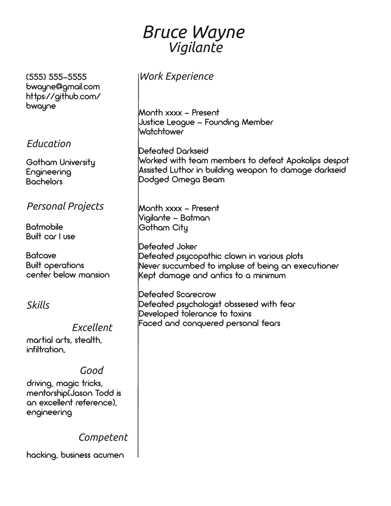
4/18/2020 - LibreOffice
Unfortunately, the first thing I noted when starting to use LibreOffice is the lack of support for layers. This was a useful feature of Scribus that let me use my sketch as a transparent reference in the background layer. While not necessary, it was a nice convenience.
As I began to build out my layout I started encountering more complications. I didn't plan on using styles for the first sample, but I wanted to make sure I knew how they worked. But LibreOffice Writer didn't seem to have styles that I could apply to text frames. Every time I went into a a text frame the styles wouldn't be a usable option. Searching through google, I found a mailing list entry that indicated this didn't work and to use Insert > Frame instead. This did work and allowed me to apply styles. The default frame was unattractive but I could easily create an ideal frame style later. To apply styles I would just identify my text and select the style I desired. I wondered what the point was of these two different objects. Google showed me this question. It appears that text frames are much simpler structures with some niche use cases. The question notes you can copy text frames in Draw or Impress but can't with frames.
Applying styles in frames worked but it doesn't show the styles in the navigator if they're in a frame. Again, this is a minor inconvenience, but I now appreciate the story editor in Scribus. Having all the text content laid out and being able to apply styles via a side bar feels like a great UI choice. Especially when text spans multiple boxes. Writer's navigator can do this if I type like a word processor, but not with frames.
This is my sample document in LibreOffice. When desiging the layout, I found the alignment tool in LibreOffice isn't quite as good as in Scribus. I can set anchors to certain objects(like frames), but not other objects I've drawn. I also can't select both my drawing and frame and align that way(this is how Draw does it). I can come up with work arounds for my sample but it's something else to note.
What I liked:
- Lots of premade styles that can be easily edited
- Integration with LibreOffice Draw makes it easy to draw and add simple images
- Odf has some overlap with Microsoft Word and Google Docs
What I Disliked
- No layers support
- Alignment tools don't work well with images
LibreOffice's familiarity is attractive, but I struggle a lot when creating my desired layout. The question will likely be whether it's worth struggling with LibreOffice to use a familiar application.
4/19/2020 - Revisiting Latex
Ah yes, Latex, we meet again. When I started this project, I honestly expected to try out some GUI applications
and then find that Latex was still the best choice. My impression was that GUI applications were mainly for
ease of use. However, my investigations with Scribus and LibreOffice have shown
that was just my ignorance. Desktop Publishing Software has plenty of features to allow for formatting and allow
me to focus on content; which is supposed to be the selling point of Latex. I still need to learn more about
desktop publishing, but I know typesetting my desired layout in Latex will also take an
indeterminate amount of time.
As I've been using a pre-made Latex template for my old resume, I already have an estimate of how difficult it
will be to typeset, even though I've not made an entry in this blog.
The biggest draw to Latex right now, is I can use vim to edit my Latex files. I still prefer to use vim for text documents and I can't use it in LibreOffice or Scibus. But I don't think this minor idiosyncracy is enough to justify using Latex. So I will throw out Latex as option.
The other thing I've realized is that Scribus's story editor is similar to Latex; in which you focus on content and annotate the content. It annoyed me at first, but approaching it from a Latex perspective helps me appreciate it more.
4/22/2020 - The Decision
At the beginning of this project, I started with a bias towards Latex. But after learning about LibreOffice's DTP capabilities and how styles can help with formatting; I began to consider it the frontrunner application. Now, after trying it out; it doesn't quite have what I need. I had to resort to workarounds to get the layout I wanted and I almost considered dealing with them to use LibreOffice. But LibreOffice doesn't handle drawings with layout well. I can make some workarounds with frames but drawings don't align easily to each other. I want to keep my resume simple, but having small images and lines adds a nice visual flair. In the case of the meters for skills; they actually aid in rapid understanding of my resume. I don't want to give these up so I won't be happy with LibreOffice. I'll have to use Scibus; the unlikely dark horse in the competition
It might seem unusual that I'm so fixated on LibreOffice or that Scribus is the "dark horse". In the "What I Liked" it seems like Scribus is a clear winner. But there was a critical aspect of my selection process that it didn't make sense to discuss before. A resume is not a one time document. I will have to make edits and updates over time. And I may want to change and alter the layout occasionally as well. I have no interest in further Desktop Publishing right now so the only use case I have for Scribus is my resume. That means I wont really stay up to date with the application. I'll likely have to have some sort of "Scribus Review" every time I want to make non trivial changes(layout and/or formatting) to my resume. Hopefully, this wont be too frequent, but it doesn't compare well to LibreOffice.
I have been using Word Processors since a very early age and feel familiar with them. It'll take some time to adapt this workflow of using styles but it's not an extreme shift. LibreOffice Writer is going to be an application I use regularly for most other documents. This would give me a familiarity with the tool which is preferable if I'm using it to maintain my resume. I wouldn't really need any kind of review with LibreOffice. If anything my resume work would help my ability to use LibreOffice for other kinds of work. Because of this I was willing to put up with some workarounds to stick with a tool that I can develop skill with. But I should only compromise so much; if it's not the right tool, I should just use the right one.
I mentioned earlier that if I chose Scribus; I would also consider InDesign. But when I went to investigate the cost of InDesign, I found that its $240/year(April 2020). I mentioned I don't plan on doing more DTP so this $240/yr is effectively a "resume upkeep" cost. This is far too much for me to consider. I note that when Grossbart selected InDesign as his preferred application; it was still a purchase, not a subscription. Even if I do prefer InDesign I can't justify this cost so I'm not even going to bother to try it.
I think the design principles in Byfield's book will still be useful and I will try to follow it if I can. I think my workflow should be to fill out sample content and then pick some fonts initially. Then I'll manually format to my liking before converting everthing into styles. Finally, I'll polish up the layout.
4/28/2020 - Finishing Sample Content
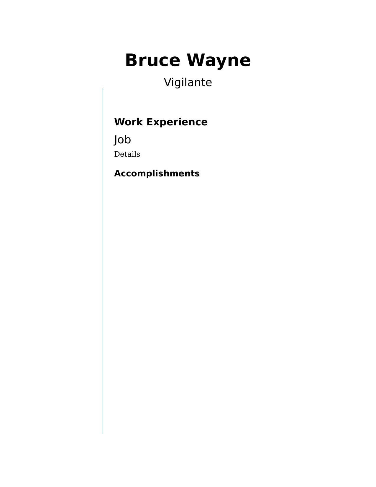
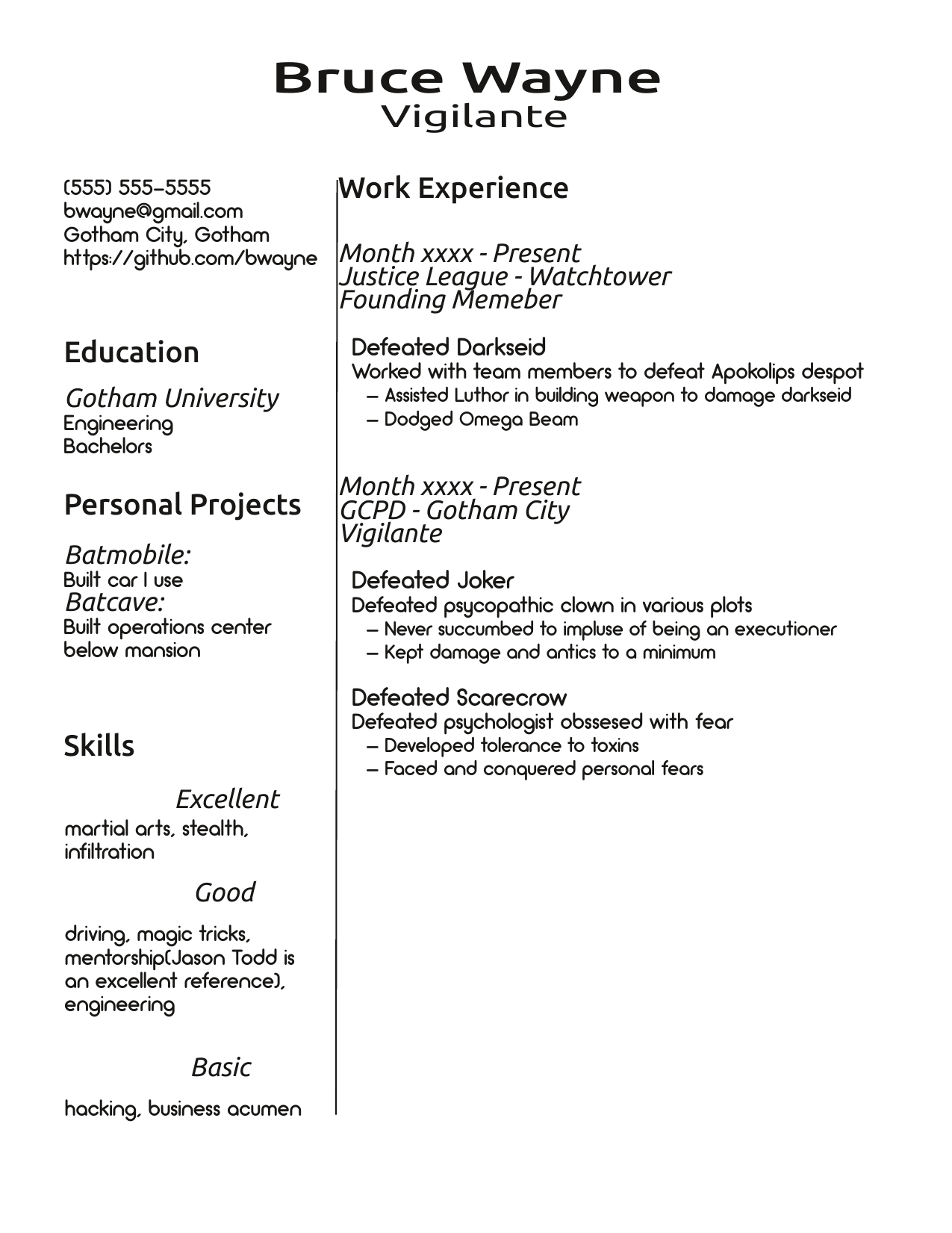
I want to start by filling out the fake content of my resume. The content is relevant to my layout so I can't just use latin filler text. Seeing where details about different resume entries are and how they present is critical. But I didn't want to fill everything out until I knew which application I was settling on. I also didn't want to use my actual information. I knew I would focus too much on the content so I decide to use Batman. I can create fake, but purposeful entries based on my background knowledge of Batman. This isn't going to be completely accurate but it should serve my purpose. Once the sample text is done, I can pick out an initial set of fonts. Then I can finish manual formatting, layout, and styling.
This is the initial draft of the sample. I doubt it's accurate or thorough but it should give me an initial start for the relevant design aspects of my resume.
5/03/2020 - Picking Initial Fonts
Now that I've put in some sample content I'd like to pick some fonts to start with. I want to start with some direction for fonts before I continue the layout.
Byfield has an entire chapter on font selection. I would suggest reading the entire chapter as there is a lot of good information, but I'm only going to discuss aspects directly relevant to me and this project. Byfield starts by describing font families and font styles. There are several different font families, but I'm likely to only really consider Serif and Sans Serifs.

The main difference between the two is Serif fonts have tails on the letters that's supposed to make theme easier to read. Byfield mentions a lot of heuristics with the two families; such as Serifs being more common for body text in print. Sans Serifs are supposedly more "modern" and look better on screens. He also mentions that font selecion is more of an art instead of a science so I'll probably have just have to try a bunch of fonts and see what sticks.
He also talks about fonts styles(bold, italic, etc.) but mentions these are very unstandarized. It's probably not even worth for me to consider this detail analytically and I should probably just eyeball different styles and see what looks nice.
Another point Byfield makes is that the convention is to use two different fonts. One for headings and one for body text; more tends to draw too much attention to document design instead of content. I originally considered using a thid eye-catching font just for my name and resume title. But I think the point is valid, so I will try to stick to two.
There's a lot of information on selecting different fonts but at this point I want to just start looking at fonts and see what I like. One aspect Byfield mentions is to select fonts that are "similar" to each other. This is a difficult thing to determine, but one method he suggests is to select fonts by the same designer. After searching for free fonts on google, I found a group of fonts all by the same designer, Matt Ellis, that I like. The fonts are made freely available so I shouldn't run into any legal issues.

Arciform Sans is the clear standout for me and after trying it out I easily selected it for the resume content. Alcubierre is very popular and suggested for titles but the font feels a little too thin. None of these fonts have bold or italic styles so I can't use those options. Athene feels a little wispy on my screen; so I don't think I'll use that either. Arctic is a nice font but I really don't like the v letter. V isn't an extremely common letter, though, so I'll keep Arctic in mind as a backup.
Ikaros looked very promising but the tail on the capital P feels too short.

I do intend of using "P" in the "Personal Project" heading so, unlike the v in Arctic, the capital P is important. I can't believe I'm being so picky over such pedantic details, but I guess that's design.
While considering other fonts; I happened to look at my blog more closely. At this point, I've taken Grossbart's advice and updated my blog's font. The font is, at the time of writing, Ubuntu. This is a free font that has a similar "curvature" to Ellis's fonts. It also has more styles available, which is nice to have for headings.

I tried this out and find that I like it. For the moment, I'm italicizing the headings but I may change that later.
The final point of discussion is what Byfield refers to as the "color" of the page. This does not correspond to a physical color, but how light or dark the font appears. This seems to be primarily based on font size and line spacing. This is useful, however, because once line spacing is determined, it can be used as a "magic number" to guide other aspects of the doucment. Byfield mentions this process can take a lot of experimentation but has some guidelines listed.
After experimenting I decided to use a 14pt font for the content, 16 pt for the headings, 28 pt for the title, and 22 pt for the subtitle. Arciforms Sans is a bit of a smaller font so the increased size makes sense. I'm using 15 pt line spacing for the content. This is all subject to change but should give me a nice starting point.
Something I think is really important to mention is how incredibly useful styles were for this entire process. Despite still being in the "design" phase, I set the default character style to the body font and made a second one for the heading I applied to the headings and title. This allowed me to quickly experiment with different fonts/sizes and see how they'd look. I used Scribus's preview mode to view the rendered document and the styles window to change them. It was much faster than highlighting and changing large blocks of text and the workflow felt great.
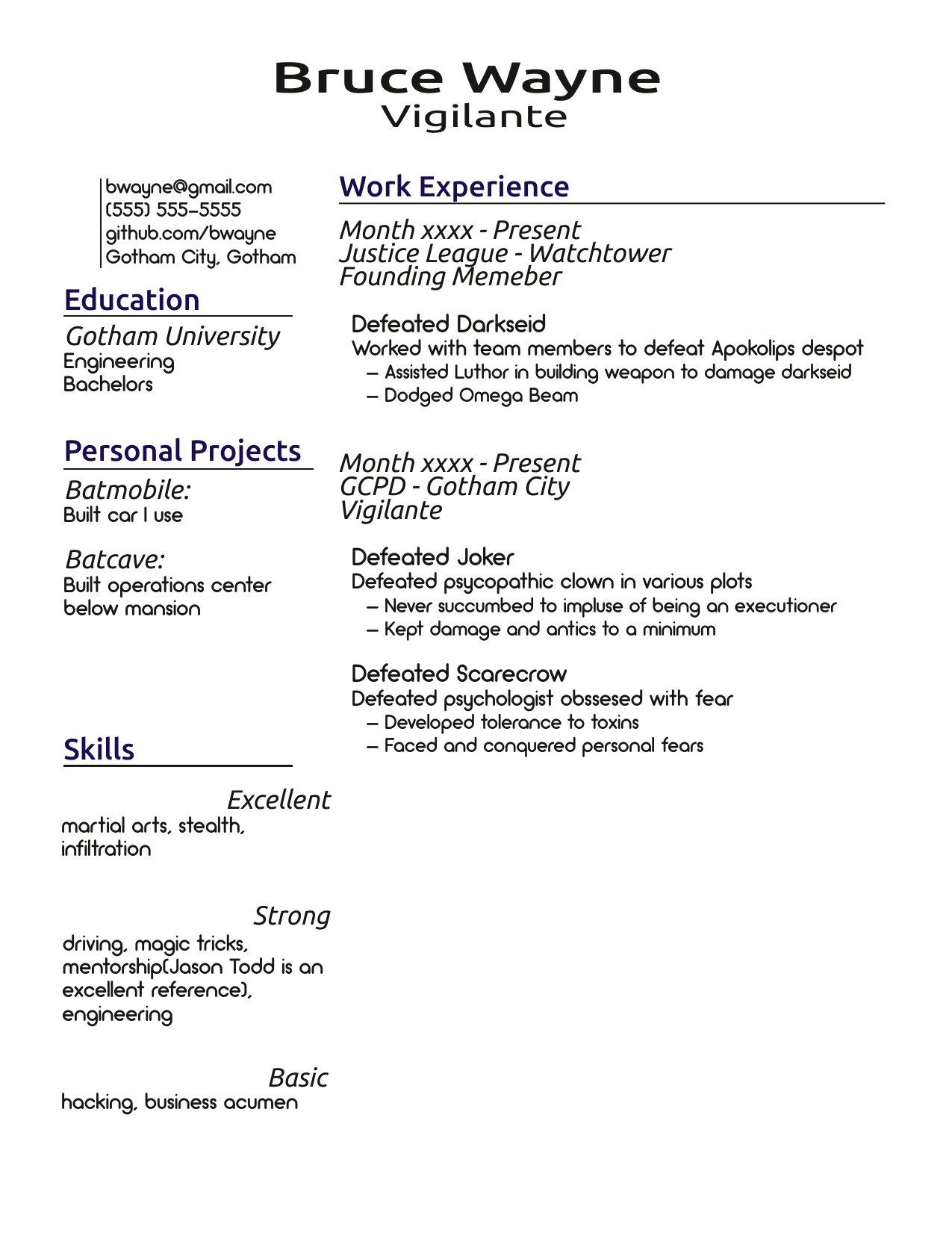
5/24/2020 - Finishing Initial Styling
This is my resume with the styles developed and associated to different text groups. My main goal here was to show clear seperation and hierarchy between different parts of my resume with indents, size, and style.
I also made some changes with the ordering and word choice. I moved the company name and location to the same line and put job title afterwards; as I think the company and location are more closely tied to each other. I also added the city to my contact info section. I never liked the idea of an address on my resume, but I think adding an approximate location is a good idea. Finally, I changed the last skill entry to basic instead of competent. Basic conveys the idea that I know something about these skills/areas but don't have a very deep background; which is my intention.
One aspect I struggled with was how to emphasize the resume title. I didn't like the look of just making it larger. But with Scribus's fine control I could actually stretch the text horizontally and I liked this distinct emphasis.
Styles were incredibly useful here, they really helped me save time and improved my design process. Why did this happen this time? When I tried using styles in my first attempt they showed potential but were a lot of work. But that didn't happen this time, even though I'm still in the design phase. The main reason was that I followed Byfield's typographic principles. Recognizing that I would only need two fonts(one for body and one for heading); I set the default character style to my body font and created a second style for the heading which I applied to the relevant areas. This was a trivial amount of work but allowed me to leverage styles in my initial font selection process. As I continued to work, I simply branched out and kept inheriting and modifying my styles as needed. Again, this was very little work, but allowed me to continue using styles and changing them as needed. This typographic, styles first approach let me make full use of styles in my design process without introducing unecessary amounts of work.
This was definitely a different design process, but learning it will be extremely useful in future; even when I'm working with documents and styles in LibreOffice. Byfield was correct, once I changed how I thought about my process, I found styles to be incredibly useful. However, I can also easily see why people may not like styles; especially if they don't follow this workflow. I can also see how styles are influenced by programmers. Though I don't feel like many programmers use or even know about styles.
5/29/2020 - Finishing Layout
I used a grid along with the align and distribute tool to assemble the final layout. I also made a few other changes. I changed "good" to "Strong" as a skill tier, because I think good is very weak adjective. I also changed the section seperation to be horizontal lines under the headings instead of a vertical line. This feels less crowded and a lot more clear with the section emphasis.
The final change I made is one that may not be noticeable. I wanted to change the color of the headings to something more distinct, but this felt too bold for a technical resume. As a compromise, I used Navy. This is barely perceptible, but I think it does draw the eyes to the headings even if it's not obvious as to why. It's subtle, but I think it works. And if not, nobody will notice anyways; so it feels like a small risk. The resume still looks excellent in black and white; as per my original design goal.
The last step will be to add the meters for my skills and add icons for the contact info. Then I'll be done!
5/30/2020 - Adding Icons
For the last step I added icons to each entry of the contact info section using freely available clip art. And I added the meters for the skills section. I made the borders of the meters a little more rounded because that feels consistent with the rounding in my fonts. Now my resume template is complete! All I need to do now is a final evaluation.
5/31/2020 - Final Thoughts
This was a very long process but I'm satisfied with the result. I learned a lot, not just about Scribus and LibreOffice, but also typography and aspects of print design in general. I'm certain this knowledge will be useful when I need to make documents in the future. I definitely feel that Scribus was the right tool for the job; I would've struggled way too much on layout in LibreOffice. There was definitely a learning curve but it was worth it.
One final aspect I want to explain is why I don't have any entries about feedback. It's reccomended that most resumes are reviewed by friends and colleagues. As I mentioned in my goals; I wanted to create a template based on my design for my resume. Now that I have the template; the more personal task of creating my own resume can begin. I will give this to others to review but it will not be a public process.
However, this blog does show how I implemented the design and what decisions I made. I hope these aspects will be useful to others who are designing their own resumes. The personal details of my own resume are not relevant to that process. If I find out that Scribus was actually the wrong tool(not sure how but it could happen); then I will make an update with that information. But otherwise I am satisfied marking this project as completed and successful.